Toggle navigation

If you own a business website, have you ever checked how it looks on a mobile screen?
Given the proliferation of mobile devices, creating a mobile-optimised website has become the need of the hour. If statistics are to be believed, over half of the web traffic across the world comes from mobile devices. (See Graph).
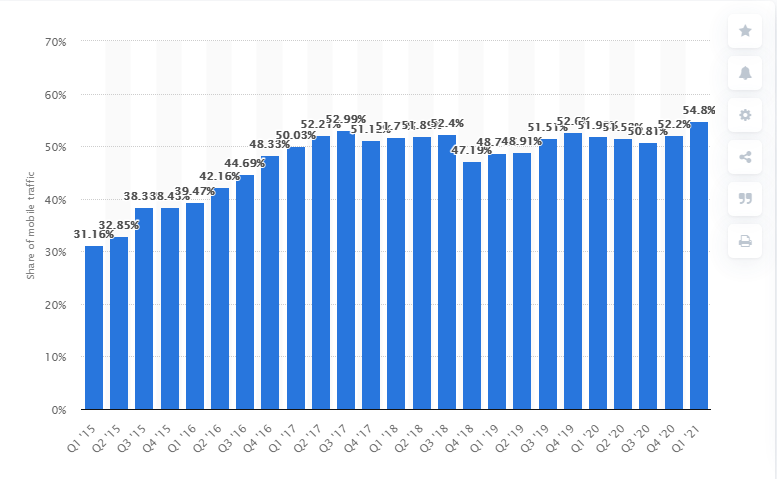
Percentage of mobile device website traffic worldwide from 1st quarter 2015 to 1st quarter 2021 (Source: Statista)
And this should not come as a surprise. It is understandably easy for people to browse the internet from their mobile devices. Besides, around 80% of internet users own a smartphone. No wonder, you see people glued to their smartphones all the time.
So, if you are not optimising your website for mobile devices, you are likely to miss out on a large opportunity.
Even Google made it clear years back that it will prioritise mobile page loading speed as a crucial metric for determining search engine ranking.
A mobile-friendly website will help you gain more traffic in the short as well as the long run and prevent mobile users from bouncing off your site.
In this blog, we will discuss how you can optimize content for mobile.
But first, let us see what we actually mean when say ‘mobile-friendly’ website. A mobile-friendly website simply means that your content appears well not only on desktops and laptops but also on smaller mobile devices.
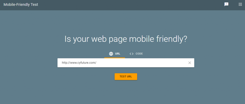
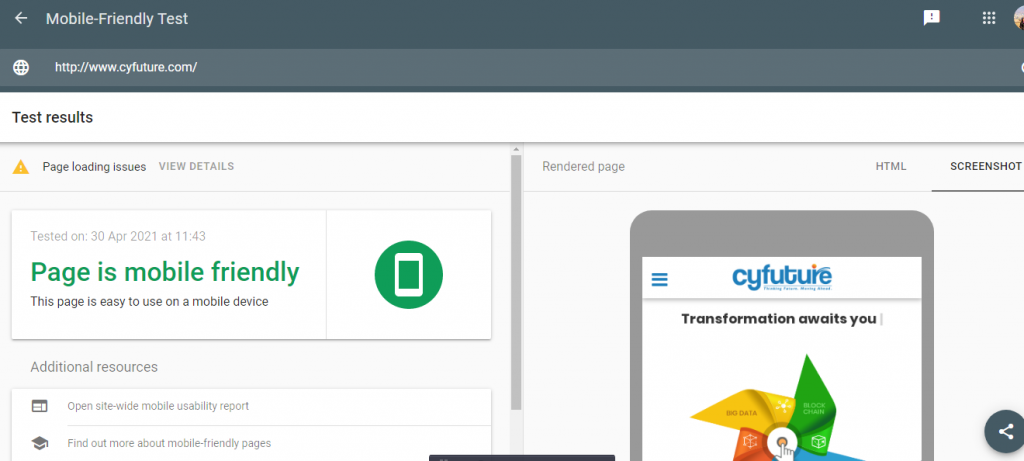
It’s possible that your website may already be mobile-friendly. Now the question is: how you can test the mobile friendliness of your website? Simple. Google’s mobile-friendly test tool comes in handy here. All you need to do is to enter your website’s URL. You will get an assessment of how mobile-friendly your site is. (See images below).
Now, let’s go ahead and discuss what you need to do to make your website mobile-friendly, if it isn’t one yet.
If you are an established website with lots of content, this is probably not the best option but if you have just started out or have a low-traffic site, this can surely be a quick fix.
And if you have a WordPress-based website, the task will be quite simple.
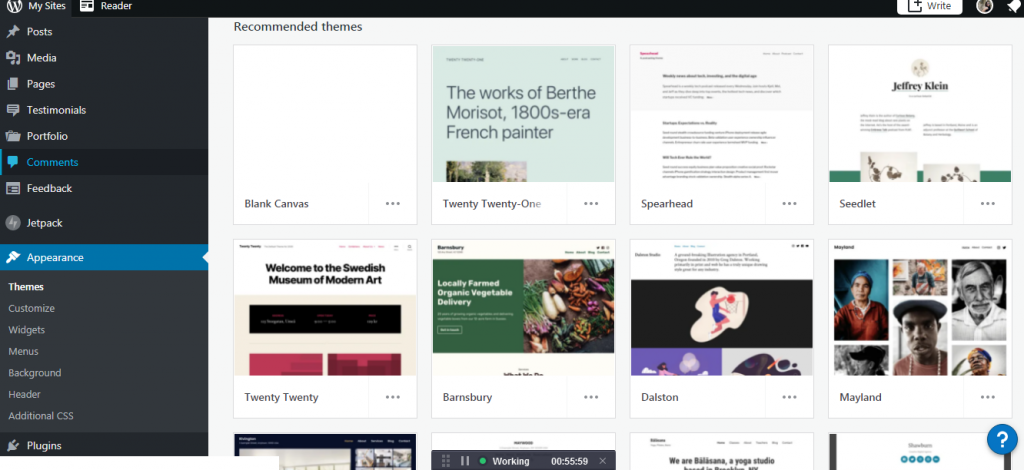
All you need to do is to go to your WordPress dashboard, hover on ‘Appearance’ in the left menu and click on ‘Themes’ in the drop-down that follows. Click on ‘Install Themes’ on the page that follows.
Type in ‘Responsive’ in the search bar and press search.
This will bring up all the themes on WordPress that are responsive. You will have hundreds of themes to choose from. Choose a theme that suits your website. Make sure to check how the new theme looks on various mobile devices.
We all know there is a lot of difference between the screens of mobile devices and that of laptops or desktops. This has to kept in mind when designing a menu.
On your desktop site, you can afford to keep an exhaustive menu with lots of options. But the 5-5.5 inch display of a smartphone does not leave you with many options.
Of course, you wouldn’t want your visitors to scroll down or zoom in to view the choices in your menu. They should be able to view everything on one small screen. If not, your conversions might get affected.
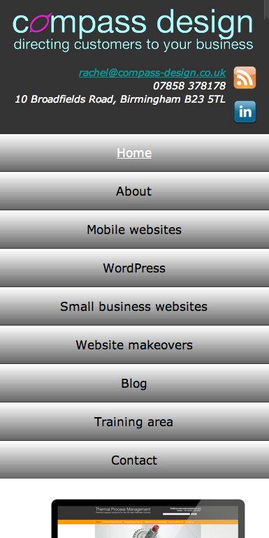
A simplified menu for a mobile website. (Source: Smashing Magazine)
Make sure each of the options on your menu fits on the small screen. If your desktop site has a sidebar, it usually gets pushed to the bottom in the mobile screen and seldom used. So, it’s better to remove it on the mobile screen.

Browsing a website on a desktop or laptop is easy. You can easily control the cursor using a mouse. But on a mobile device, things change. You have to navigate a 5-inch screen with your thumb and that isn’t an easy task by any means. This inconvenience has to be taken into consideration when laying out clickable elements on your mobile site.
Elements such as CTA buttons should be large enough to be clicked with a finger. There should be ample space between buttons so that no one clicks the wrong one by accident.
Then the placement of clickable elements is also of key consideration.
As most of the users (around 75%) use their thumb to tap on the mobile screen, it is essential to place all the buttons towards the centre within the reach of the thumb. The corners should always be avoided.

How do feel when a pop-up comes up while browsing a website? It’s annoying, isn’t it? On a small screen, these pop-ups become all the more irritating. We have just discussed how people use their thumb to navigate the small screen. In such a scenario, tapping on the close button to close a pop-up can be exasperating.
Many pop-up tools and plugins look alright on large screens but hamper user experience completely on a mobile device.
So, long story short, if you don’t want to ruin your users’ browsing experience while they are on your site, get rid of all the pop-ups from your mobile website.
If you still feel removing a pop-up isn’t the right solution, use a pop-up only when a user clicks on a relevant link i.e. a link to download a file or sign up for a subscription. This time when the pop-up emerges and asks for user information, the user is likely to be more receptive.
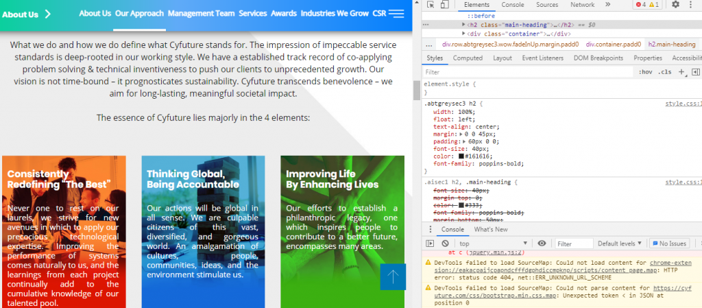
Any HTML element on a webpage-text header, paragraph, image, etc-has a width assigned to them. In order to see the ‘width’ of any element on a webpage, right-click on the element and select ‘Inspect element’ to open a panel.
When you click on an element in the left window of the panel, the CSS values for the element will be shown on the right-hand side. These values contain the width of the element among other things. The width can be specified in either of the 2 ways-in pixels or in percentage.
Now, for instance, if you specify 40% as the width of an element, it tells the browser to make the element 40% of the width of the screen. This way, if the screen size shrinks (as on a mobile), the element will also shrink proportionately to adapt to the screen size.
If, on the other hand, the width is specified in terms of pixels, the width will not change with screen size. As a result, the user will have to scroll horizontally in order to view the entire element, something no one would like to do.
So, you see by tweaking the HTML code just a little bit, you can make your site elements look good on mobile.
There is no denying that site speed plays a key role in deciding the experience of its users. Loading speed is a key ranking factor even in the case of mobile websites. So, we can start by testing the speed of our mobile site. Google again comes to your rescue here with its speed test tool.
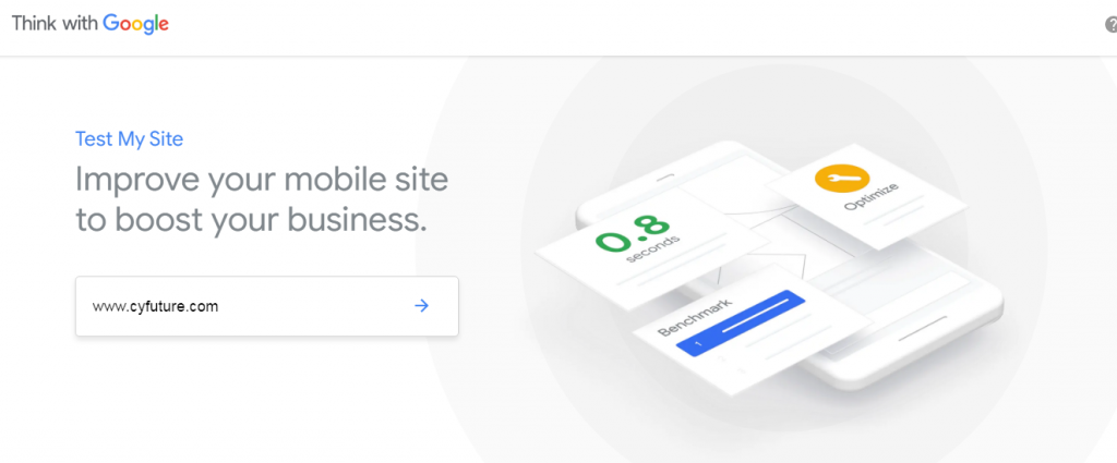
When you enter your URL on the tool, you get a report of how your mobile website fares in terms of speed. You also get recommendations on improving your loading time. Here are some of the tried-and-tested ways to optimise your loading speed:
Caching: With caching, some of the files of your website get saved on your user’s device, so they don’t need to be downloaded each time a page is requested. If you have a WordPress-based site, caching plugins like WP Rocket and WP Super Cache can be used.
Image Compression: High-resolution images can make your website load really slowly. To tackle the issue, you can use image compression tools and plugins such as TinyPNG and ShortPixel that trim down the size of your images without affecting their quality.
Minification: Minification refers to the process of minimizing code and mark-up in your web pages in order to curtail load time and bandwidth usage. For minifying HTML, CSS and JavaScript files, you have to cut down extra spaces, comments, and simplify variable names in your code.
Timely Updates: The software, plugins, themes, and CMS on your site have to remain updated at all times. This will not only allow your website to perform at peak efficiency but also keep security issues at bay.

With an aim to make mobile browsing seamless for web users, Google launched the Accelerated Mobile Pages (AMP) project in 2015. If you are wondering what an AMP is, it is simply a method for creating mobile-friendly versions of your webpages. Here, a webpage is stripped of unnecessary media files, content, and sophisticated layout and a simplified version is served to users who access your site on mobile.
If you want to leverage the benefit of this technology and create your own AMPs, the best way to accomplish this is to use the ‘AMP for WordPress’ plugin if you have a WordPress site. It is a beginner-friendly plugin that’s light on features and easy to use.
Download and install the plugin; it will automatically create AMP versions of your site’s pages. The good part is that you can make some changes to how these pages look, so you still have a certain degree of control over their appearance.
Choose Mobile Optimisation to Stay Ahead of the Digital Curve
None of us can deny that we live in a mobile-first world. The mushrooming of electronic devices has made the internet more accessible than ever before. This has spurred the demand for mobile-friendly websites that look great and perform smoothly on the small screen. Optimizing your business site for smartphones is one of the ways you can get (and stay) ahead in the online space.
If you are clueless on how to get this done, connect with Cyfuture’s custom software development experts. You can even book a free consultation with us. All you need to do is to fill out this form.
Leave a Reply